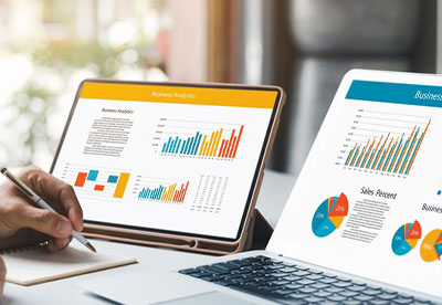
Just like how movies use great visuals to make scenes memorable and help in understanding complex information easily, similarly, data visualization uses graphics to represent data, making it convenient to communicate complex concepts clearly. Data visualization helps companies in better decision-making by presenting insights in an engaging visual. However, a lack of understanding of designs, charts, and maps can mislead the users in understanding the information. In such cases, a lack of knowledge can create more harm than good.
There are also several challenges that can make data visualization problematic, which we will go over one by one. Additionally, we will discuss where the solutions lie.
Lack of knowledge of Opting Right Chart Type
Different charts are designed to convey different information and therefore opting for the wrong graphs and charts can mislead the information. It will confuse the viewers and instead of creating a great impact, data visualization can backfire. The reason for such can be limited knowledge of data and its relationships and focusing more on visual elements rather than concentrating on effective data communication.
Thus, to prevent incorrect decision-making, the solution lies in learning more about data, and its characteristics, in order to choose the right visuals that can represent the data well.
Bad Data Representation by Oversimplifying or Over-Complexing Representation of Data
While effective data visualization involves simplifying complex data, oversimplifying it can lead to the loss of critical details, affecting decision-making. Oversimplifying data can cause viewers to draw wrong conclusions that were not intended. Similarly, over-complexing the data can make it difficult for viewers to understand the information and make informed decisions.
The solutions lie in understanding the data and including all critical points while structuring it in a way that is easy to understand for both technical and non-technical viewers.
Data Selection Bias Due to Personal Perception
Opting for only specific datasets while leaving other relevant data can create selective bias. This can be the result when readily available data is chosen while avoiding significant data that might provide a more balanced view. This practice can lead to a skewed representation of the overall dataset. One of the reasons leading to selective data bias in data visualization is because of one’s personal understanding and interpretation of data.
The solution lies in familiarizing yourself with all the possibilities of bias that may incur due to personal perceptions, and including the data which is crucial for good data visualization.
Improper Balance Between Visuals and Information
It’s important to ensure the visuals as well and the information should be well balanced. Excess of either can create a challenge for the users to understand and interpret the information convincingly. For effective data visualization, it must offer visual treats to users but at the same time must be informative and effective enough. For instance, choosing the right color palette is crucial in data visualization to understand the data better, and choosing the wrong color combination can confuse the viewers.
To avoid this, ensure a uniform graphical aspect. Designers can include the same iconography and typography in every image so the viewer can quickly grasp it.
Neglecting to Update Your Visualization
As data is constantly changing, regularly reviewing and revising data is significant to ensure the information is accurately reflected with the latest data. The reasons leading to outdated data can be a lack of automated processes, and insufficient data infrastructure making it difficult to access updated data feeds into visualization tools.
The solution lies in automating data processes, tools, or scripts to update your visualizations automatically when new data becomes available with the goal of reducing manual intervention, saving time, and minimizing the possibility of human error.
Final Words
Data visualization can do wonders for businesses when utilized correctly. It can find trends and patterns by leveraging data and helps in making informed decisions. In a world where information overloads, data visualization can give companies a competitive edge by turning data into actionable insights.
We at Canopus Infosystems understand that data visualization is not just about making data look appealing but it’s about revealing the hidden potential of raw data and presenting it in a way that can add value for businesses. Our expert team is dedicated to giving you the best solution for your data visualization needs.
3 mins read


